Interactive charts
This is a collection of interactive charts. Interactivity in data can be a powerful tool for helping the reader better understand the data. The main reason I created this section is the need for accessible content and to provide an alternative that is more accessible than the static charts listed below. The charts in the other subsections of this page are static with basic alternative texts. People who use screen readers are encouraged to first try the explore button that follows for a better user experience. I do my best to make my page more accessible. I also welcome corrections and feedback at my email if any issue arises or if you have any suggestions for improving the accessibility of my page.
30 Day Chart Challenge
The #30DayChartChallenge is a global community challenge held every April on social media, inviting data analysts / scientists, developers, and visualization enthusiasts to create one chart per day for 30 days. Each day is assigned a different theme or chart type, encouraging creativity, data exploration, and the practice of analytical and design techniques.
Tidy Tuesday
#TidyTuesday is a weekly community challenge organized by the R4DS (R for Data Science) community, aimed at those who want to practice data analysis and visualization. Every Tuesday, a new dataset is published and participants are invited to explore it, analyze it, and create their own visualizations, sharing their results on social media.
30 Day Map Challenge
The #30DayMapChallenge is a global challenge held every November, where participants are invited to create one map per day for 30 days. Each day has a different theme, encouraging data exploration and creativity through mapmaking. Apparently, I am still not good at that.


Inforgraphics
⛏️⛏️⛏️
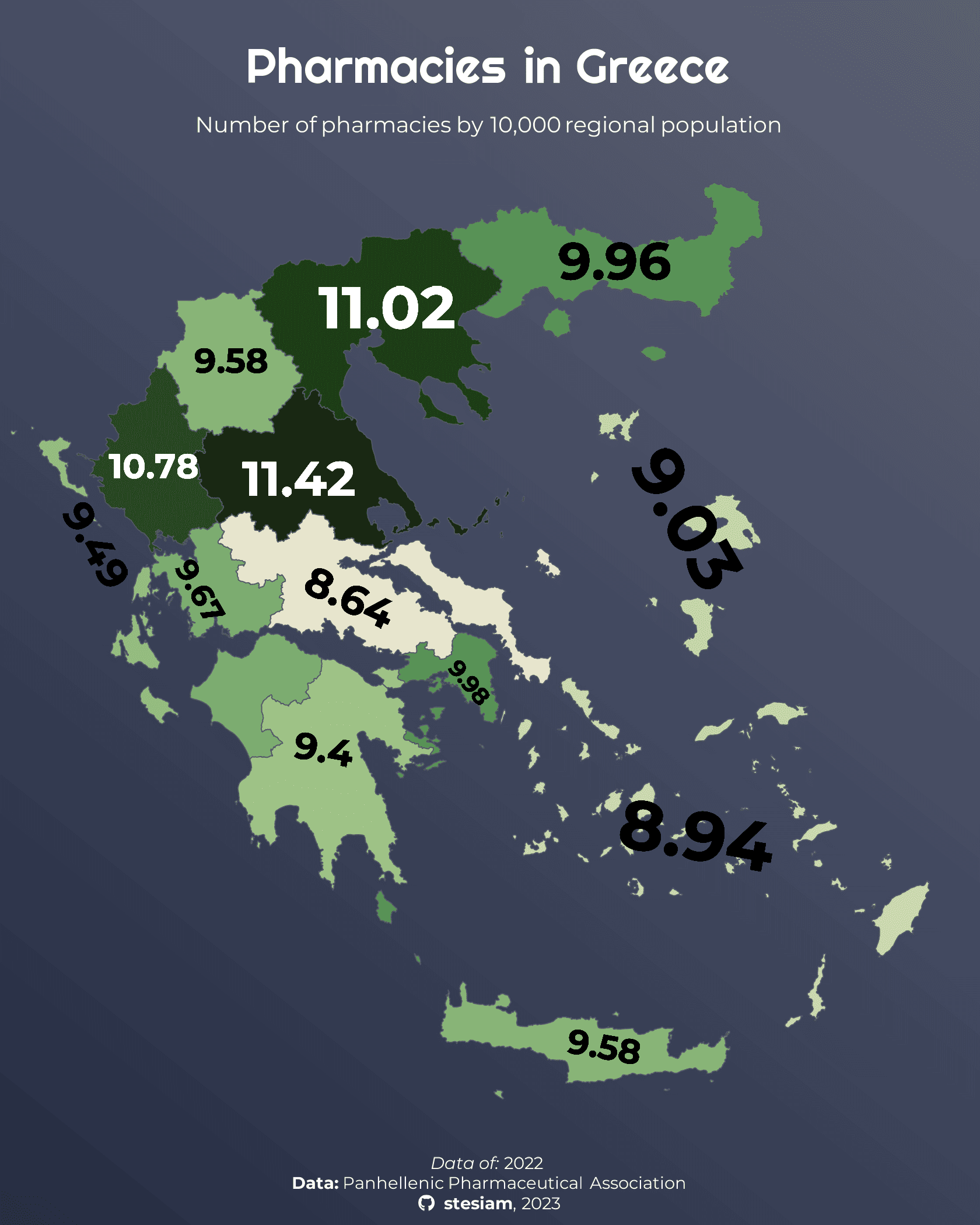
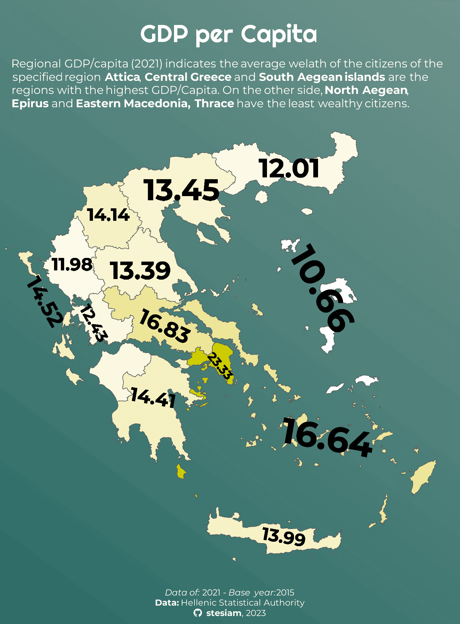
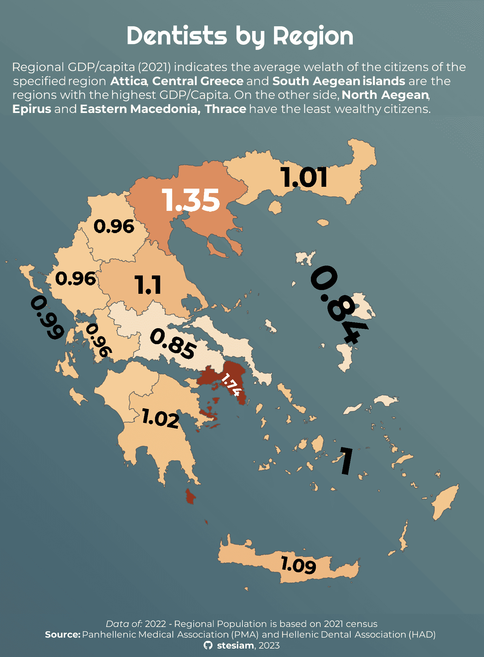
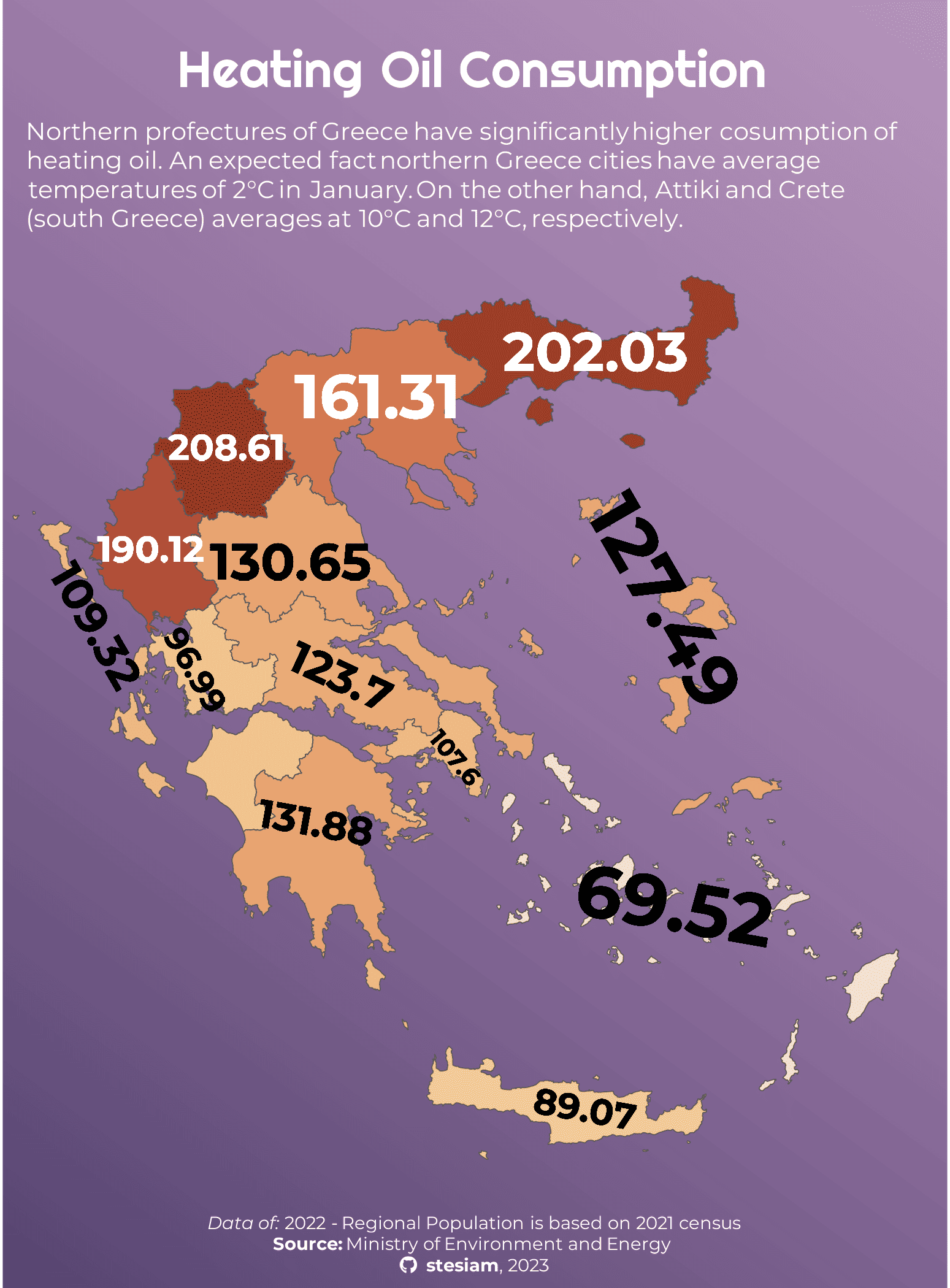
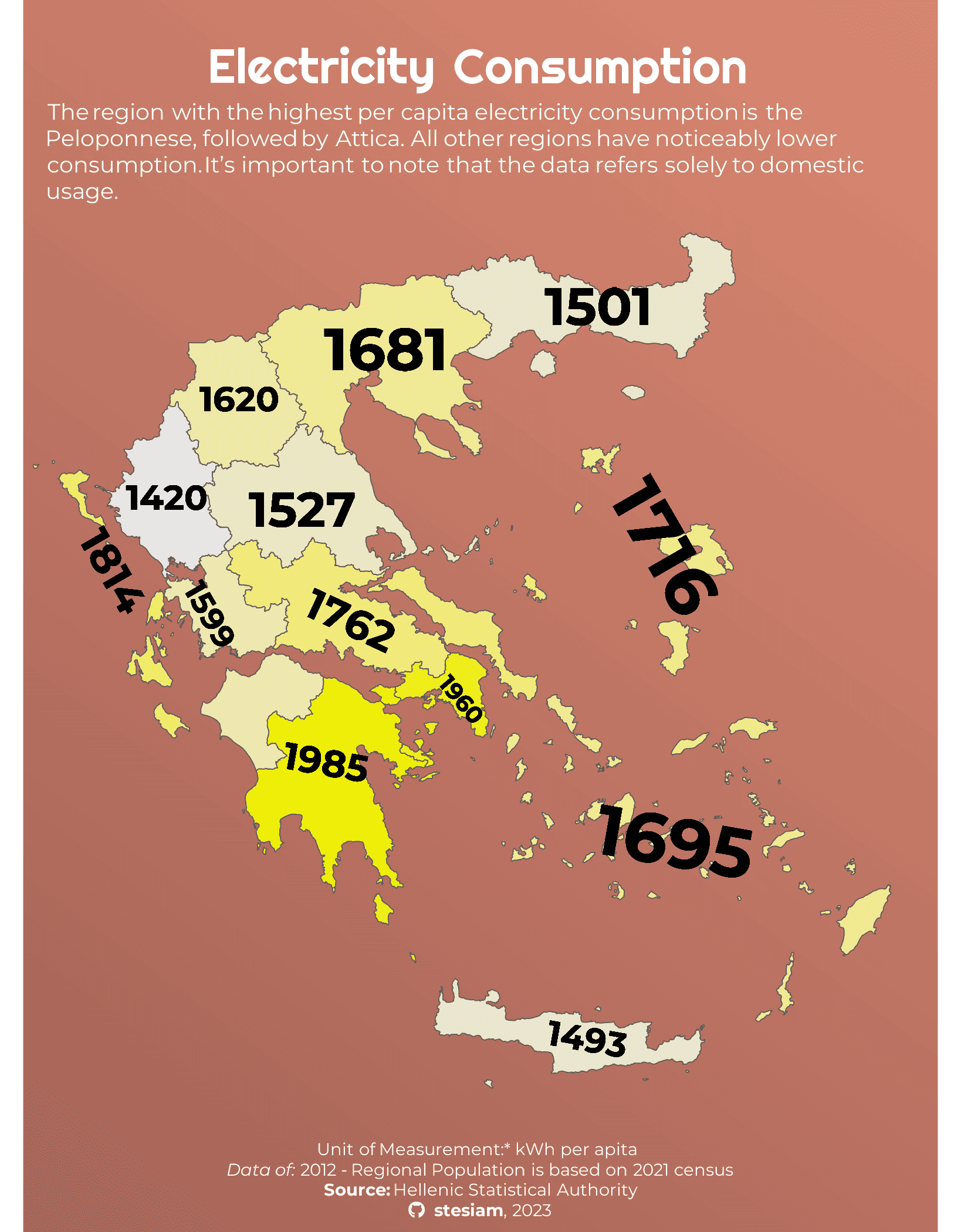
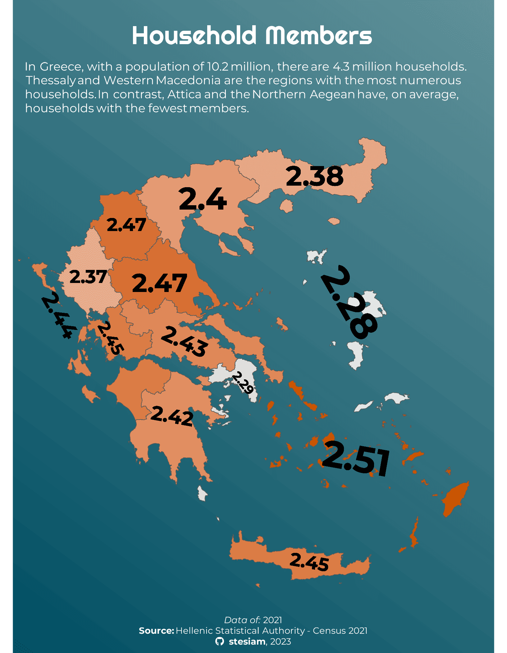
Greece in Figures
Unlike the above, this chart category is not part of any challenge. It is a hobby project featuring interesting maps about Greece, focusing mainly on topics that are not so commonly explored.
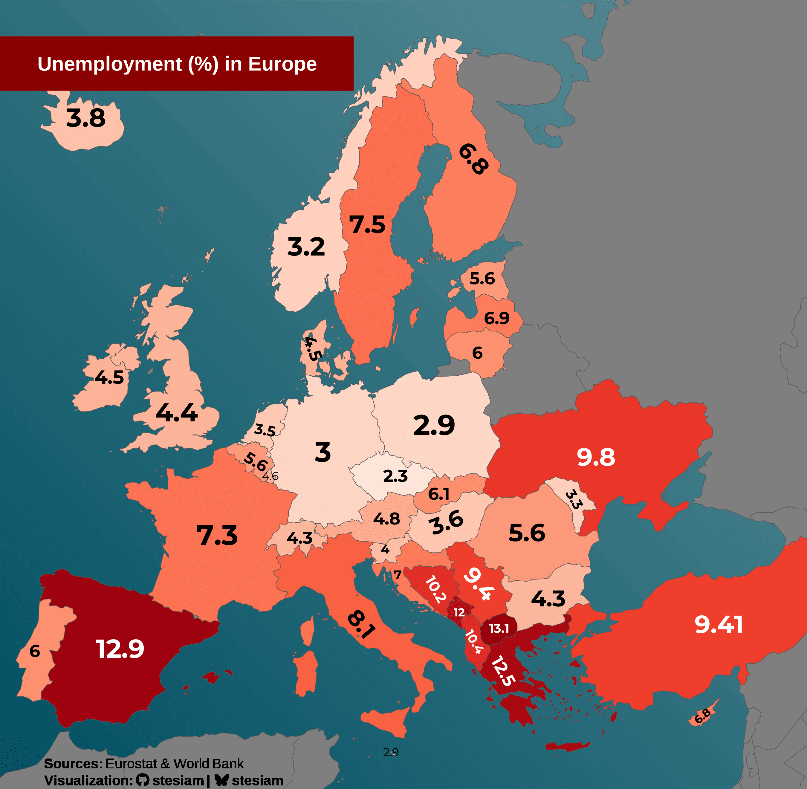
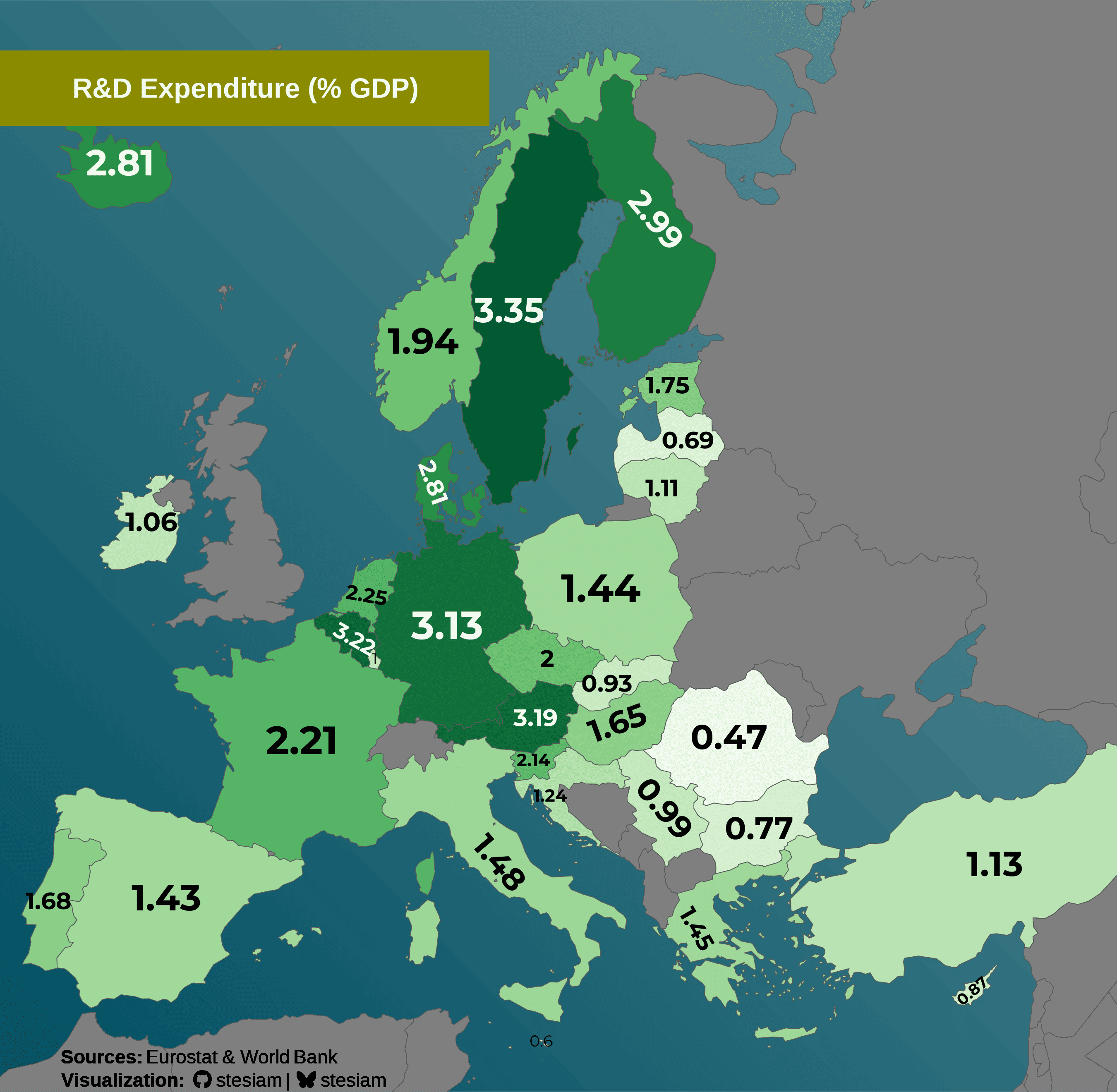
EU in Figures
Other Visualizations